Some feeling about the vastness and instability.
Do hear in a quiet environment, then something interesting will happen.
Game Engineer & Artist | NYU ITP 2017
Some feeling about the vastness and instability.
Do hear in a quiet environment, then something interesting will happen.
References
1. How would you define physical interaction?
My definition of physical interaction: interaction is the communication between two processors (either human or computer) that all have input and output channels, and at least one of the channel should be physical. Like in this picture:
2. What makes for good physical interaction?
A good interactivity should, by definition, not miss any of the links and processing ability in this picture. If there is a bad listener/speaker, either human or computer, then at least one of the links will break and their conversation won’t continue. If one of them can’t process or speak or listen at all, they cannot even setup a conversation, or at most, like a man reading a book, there can only be one-way communication. Besides, the interaction should be physical, meaning that activities like people watching and listening, are not physical at all.
And that’s not enough a good physical interactivity. A good interactivity between two processors should be efficient, therefore they should have proper level of listening and speaking that match each other, and both of them should be efficient thinker. Say a person is typing on a computer like what I’m doing now, a good interactivity is based on that I have good eyes and an efficient typing skills, while the computer has a good keyboard and a good screen, and we can well understand each other and both perform our work efficiently.
3. Are there works from others that you would say are good examples of digital technology that are not interactive?
Looking at the picture above, it is easy to find some digital things that are not interactive.
 This is a poster about design culture.
Hierarchy:
Pros: I think the design is cool because it divides the space with some slanted lines. And it adds some details to each of the four hierarchies, making it more varied and visually interesting.
Cons: The hierarchy could be better. In my point of view, I think the importance of the title should be greater than the word “Now”. And time should be more important than the place where those lectures from, but it’s actually hard to find than the place of this event. Besides, there is some redundancy in the design because the names of the four lectures are stated twice, which in my point of view can create some confusion about the information at first glance, such as you want to find the time of event and look at the bottom because there are lecturers, and thinking they should cover everything about the lecturers and lectures, but found nothing there.
Grid:
Color Pallete
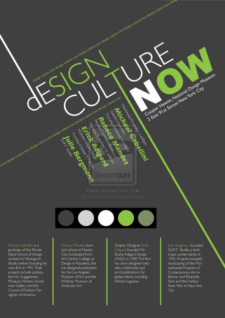 There is actually only one tune – green, combined with gray scales. There are three variations of grayscales: dark grey, light grey and white. And there are two variations of green: light green and a slight darker green.
Typefaces
Arial Black
Sowhat maybe a kind of rounded font like Arial Rounded
The result says it’s FF Zwo OT Bold Italic, but not exactly.
I love the number seven, I love stars, I love symmetric patterns.

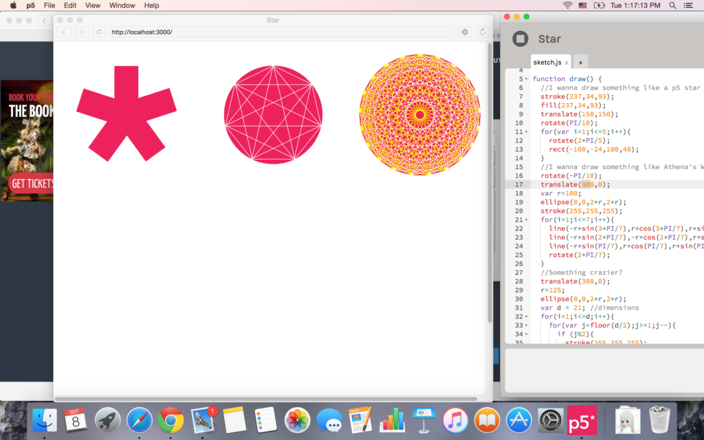
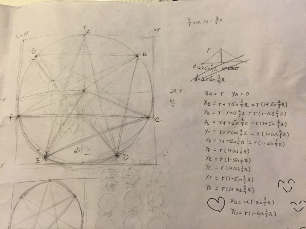 Symmetry is all about calculation, though. I went through the references and found what I need to do things quick and need. Just started from the logo of p5 and more angles, and I played so high.
 Then I thought about the seven-petal flower that I used to draw in my childhood, I was so eager to draw it out and found that closed curves can be filled as well, so cool.
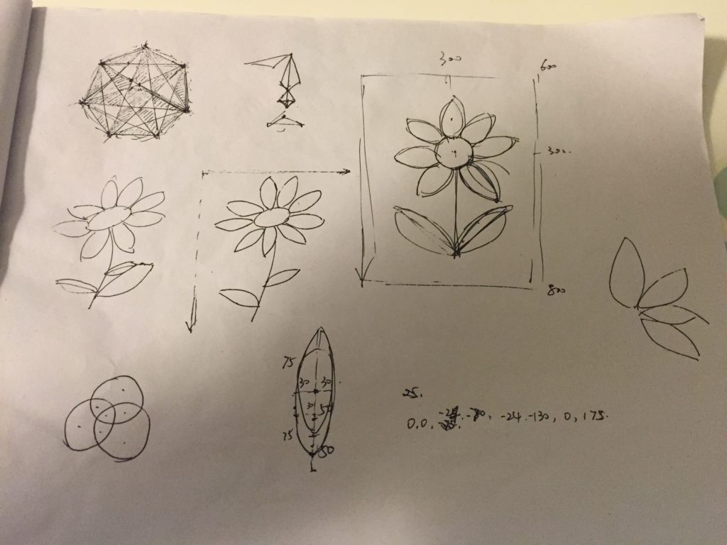 With a little calculation, it turned out to be good, but still a little disappointing.
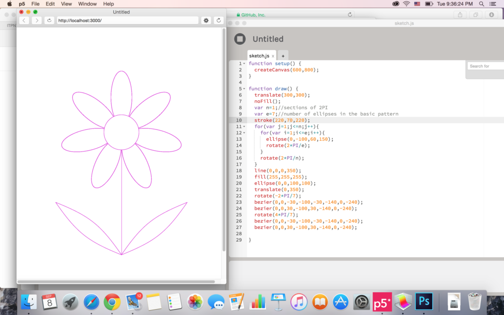 A little stray-away, though 😛
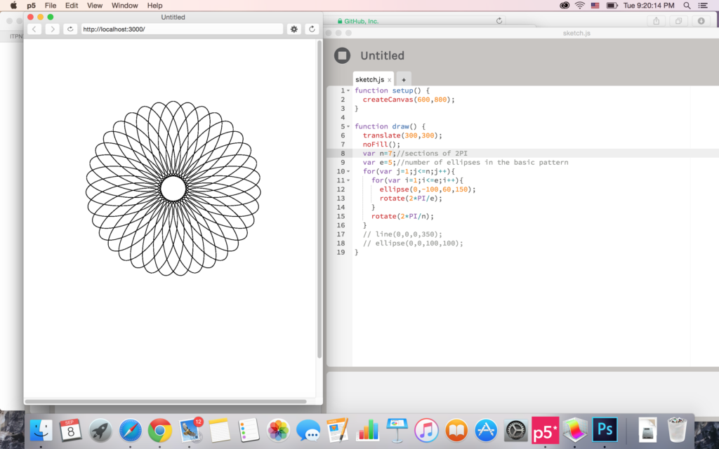 Almost there.
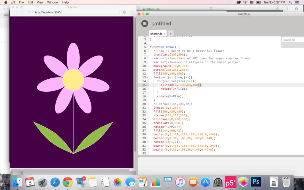 Finish.
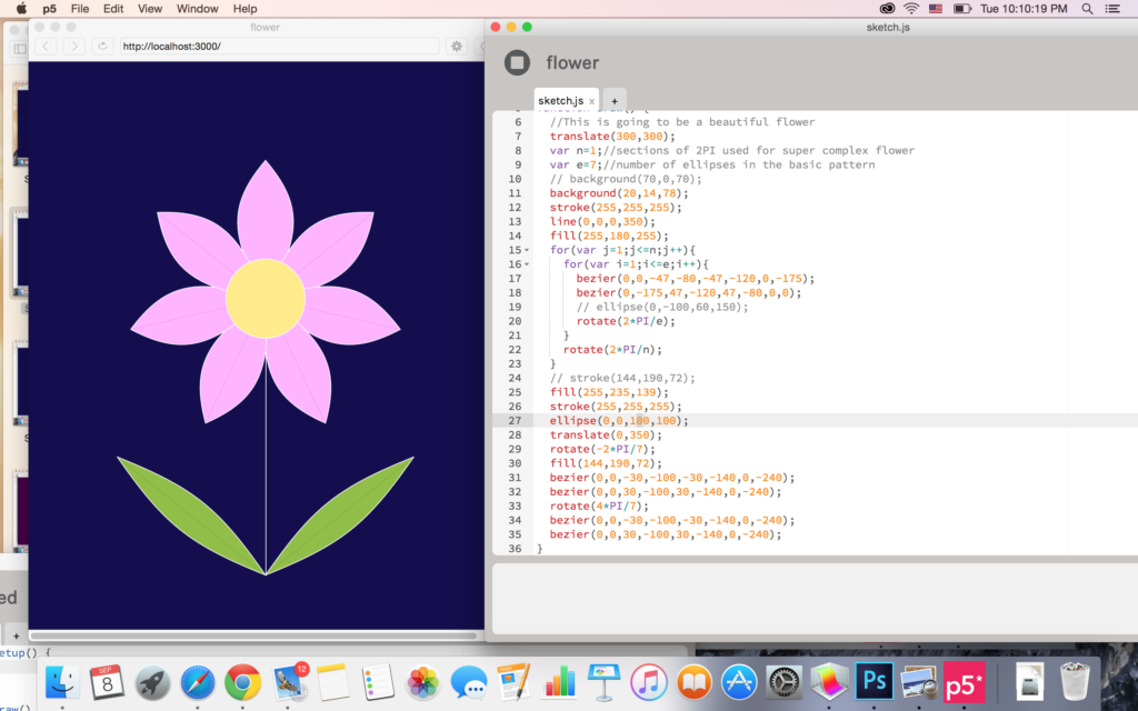
Another version replacing bezier() with arc()
This is the great prototype that we made at PComp week 1.
How can distant friends hug each other? We designed iFriend to realize this dream!
At first, we want to make a touchable hologram of a distant friend. But soon the question appeared: How can you hug a hologram? At best you can see his/her face and body, but we expect MORE than this 😛
So it came to our mind a real avatar to represent you to your distant friend. It is named iFriend!
Yep.
It is a big white soft robot like Baymax, that you can hug and send your hug to your friend. On iFriend’s head there’s a big screen for you to see your friend’s face and make it more emotional. To recognize your gestures and transmit it to your distant friend, we have two cameras on iFriend’s head, and additional cameras can be added on the wall of a room to improve precision, too. Some more sensors can be added to the robot to send more information like how hard you hug, how warm your hug is, etc.
Designers: To be completed!