I would like to create a magical dancing space.
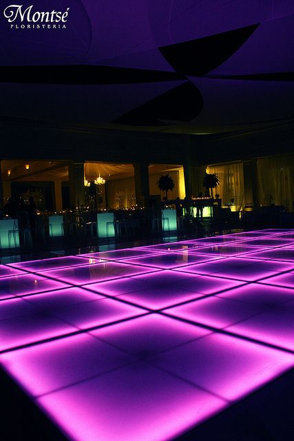

And here’s the process:
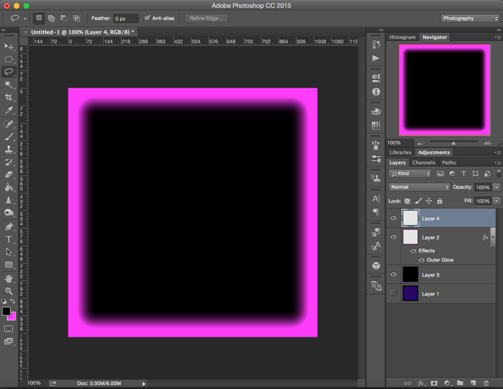
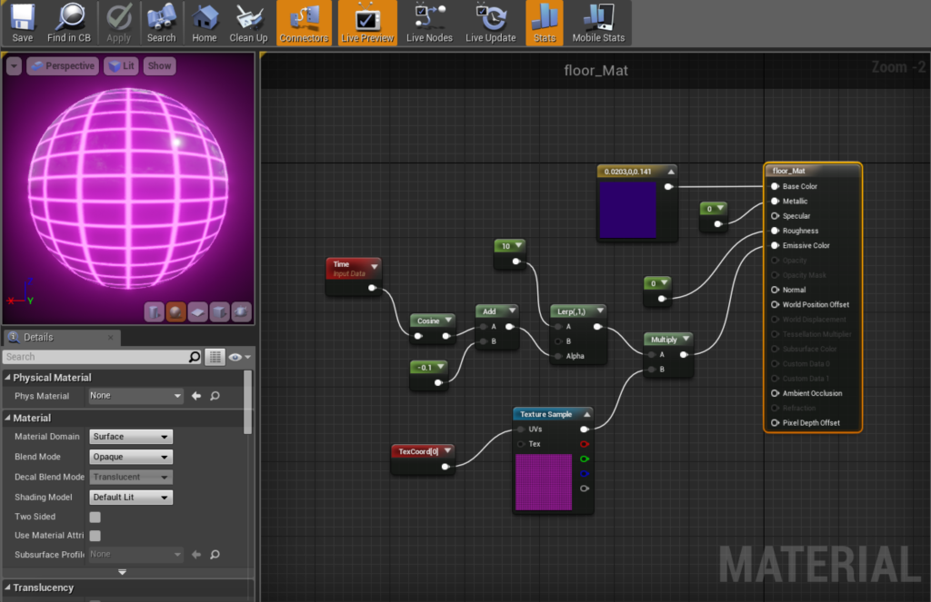
Glowing material creation
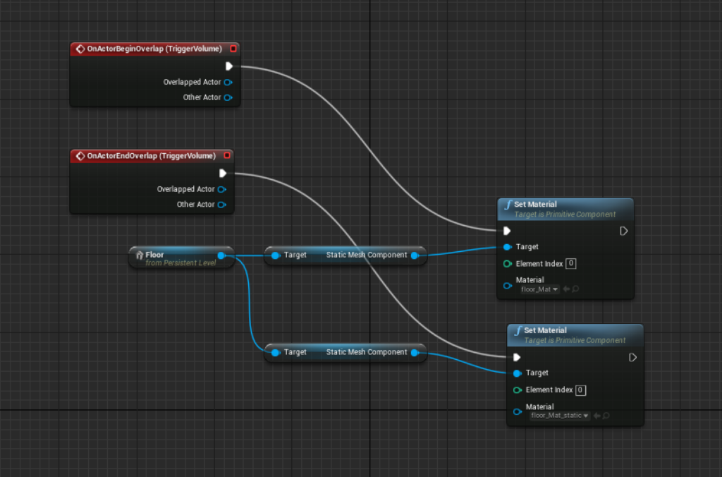
Level blueprint
Game Engineer & Artist | NYU ITP 2017
I would like to create a magical dancing space.


And here’s the process:

Glowing material creation

Level blueprint

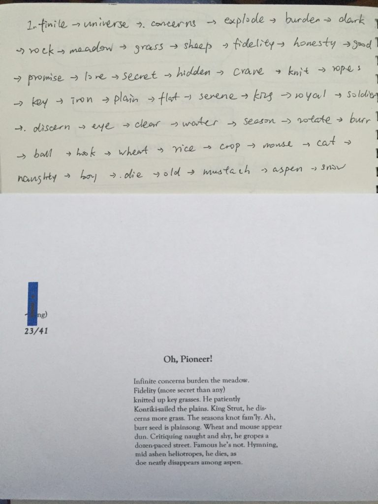
This class we were asked to use the poems for ideation of our projects.
Largely based on the poem, my mind wandered a little around the ideas.
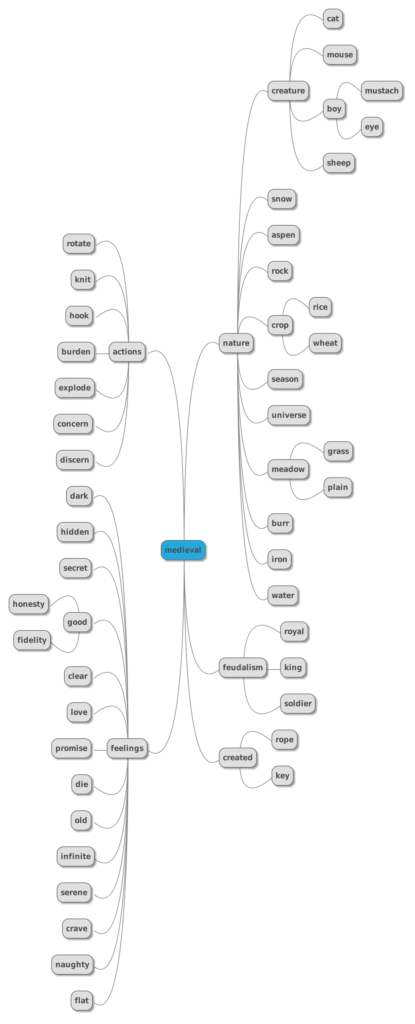
I organized my ideas using MindMup, an online mind mapping tool. And my concluding keyword for all my thoughts is “Medieval” (by a second thought, maybe “idyllic” is more to the point.)
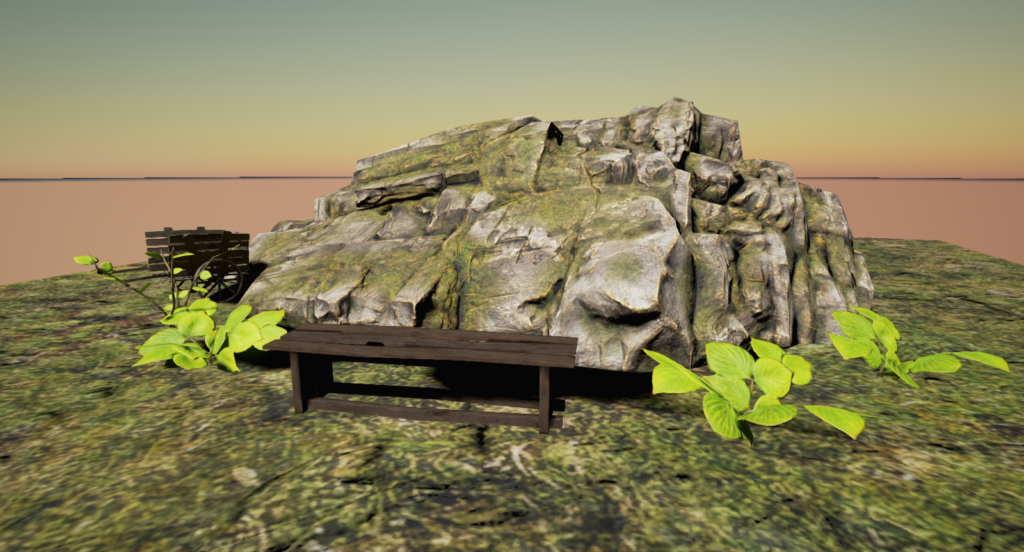
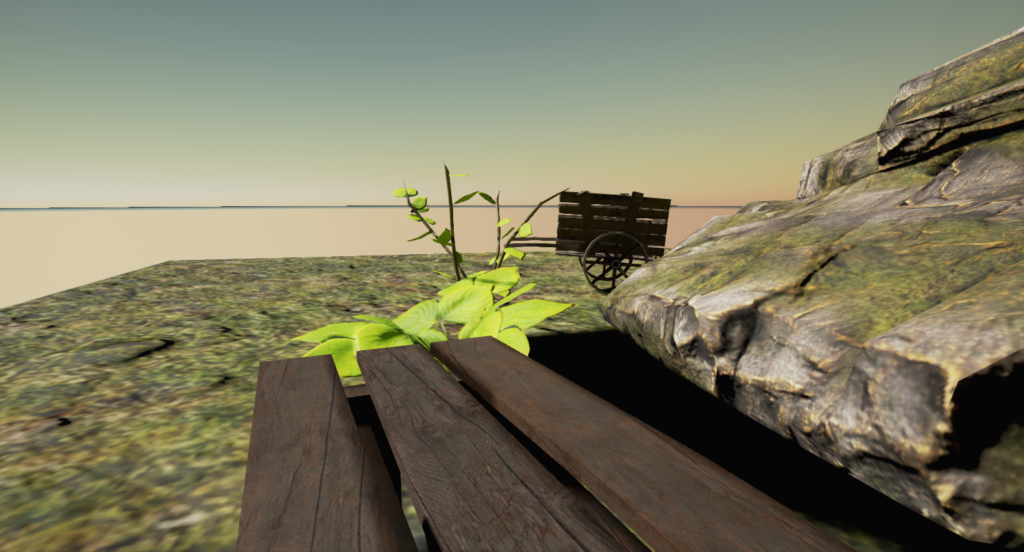
So I go through the Unreal tutorial and borrowed some assets to recreate the feeling (medieval / idyllic).
This week’s assignment requires us to visit two museums, so I chose to visit MOCA (Museum of Chinese in America) as one of my heritage, and The Jewish Museum as one I know little about.
A visit to MOCA (Museum of Chinese in America)
MOCA resides in the Chinatown in Manhattan. In my impression Chinatown is a place full of grocery markets and crowds. But it’s surprising to find such a nice and clean place, but it then feels reasonable since it is exactly where it belongs to, because it is about the history of people living just here.
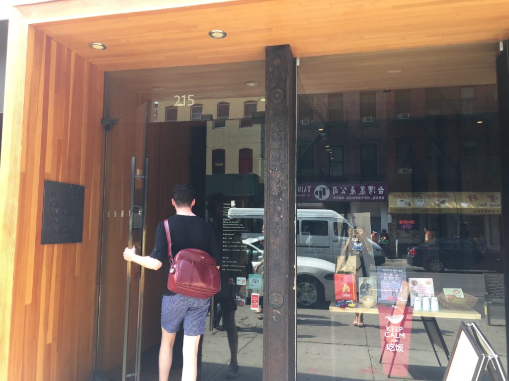
Front gate of MOCA
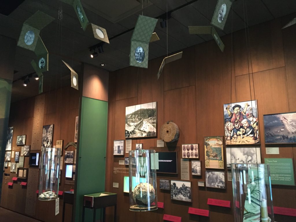
With a Single Step – Stories in the Making of America
I first visited the exhibit With a Single Step – Stories in the Making of America. It is an exhibit about the history of Chinese immigrants in the U.S. It is well organized by timeline, and it tells a clear story about how they survived earlier hardship, wars and discriminations, all the way till how they achieved nowadays prosperity. The western fantasies towards eastern culture (like Fumanchu and Chung Ling Soo), Chinese restaurants, the new year culture, medicine shop and so on, were also placed accordingly by their time.
The exhibit is full of real documents and photos and a lot of real collections. Family mails during the wars, reconstructed old Chinese restaurant and medicine shop, all feel like some lost memories, so alive and striking.
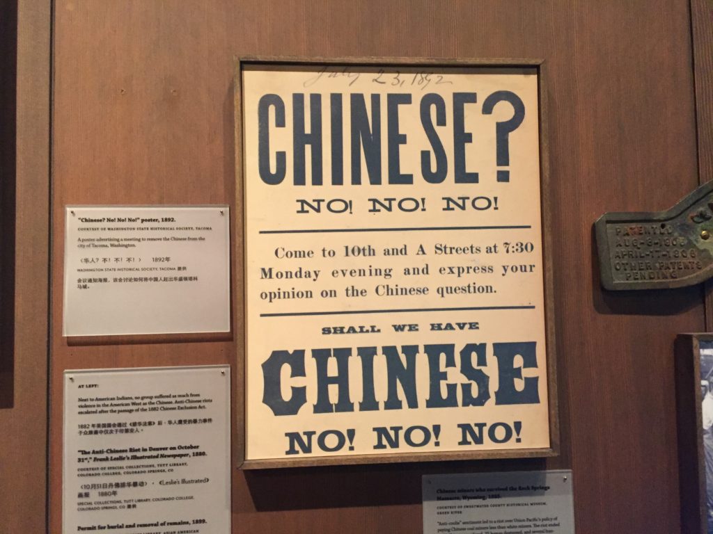
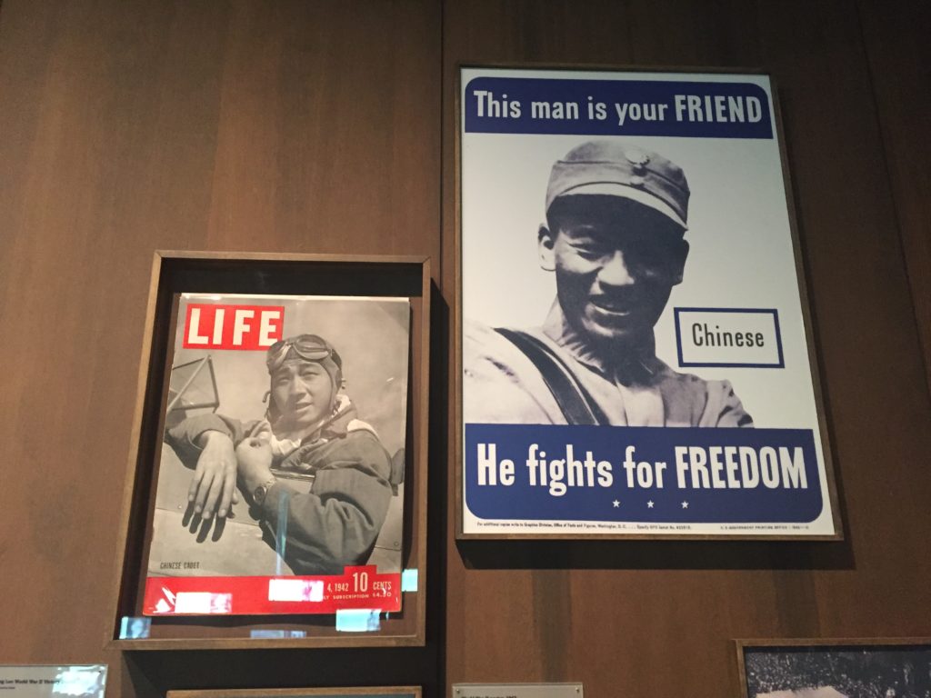
Two pictures showing the different political atmosphere
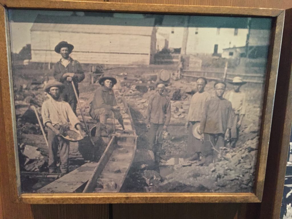
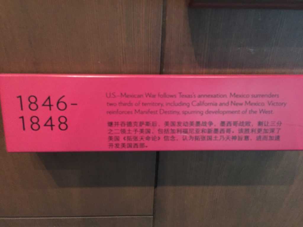
A photo about railroad workers and the related historical event
A very good part of show is that historical context is introduced, so that you can understand better what was happening at that time. For the pictures above, it introduces the US-Mexican War so that you understands why the early Chinese immigrants appeared in California building railroads.
Showing the exceptional people living those time was also very good, especially for us Chinese visitors. They all feel like positive role models during the time of hardness, easing the burdening atmosphere.
The multimedia technology plays a good part in the show. Some place features videos and sound recording and they feel more alive than the static pictures.
As for the captions, I don’t think the did a very good job. The texts are too small to read. And what’s worse, there is barely any good correspondence between captions and pictures. You can hardly guess which one refers to which.
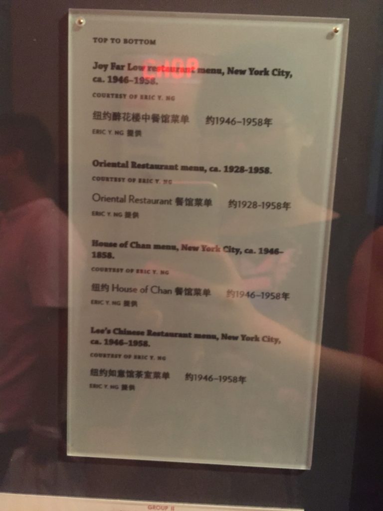
Bad captions with no clues which they refer
Overall the exhibit is ok as for storytelling, it stresses the theme well, and things are well categorized. Only the caption correspondence needs to be improved.
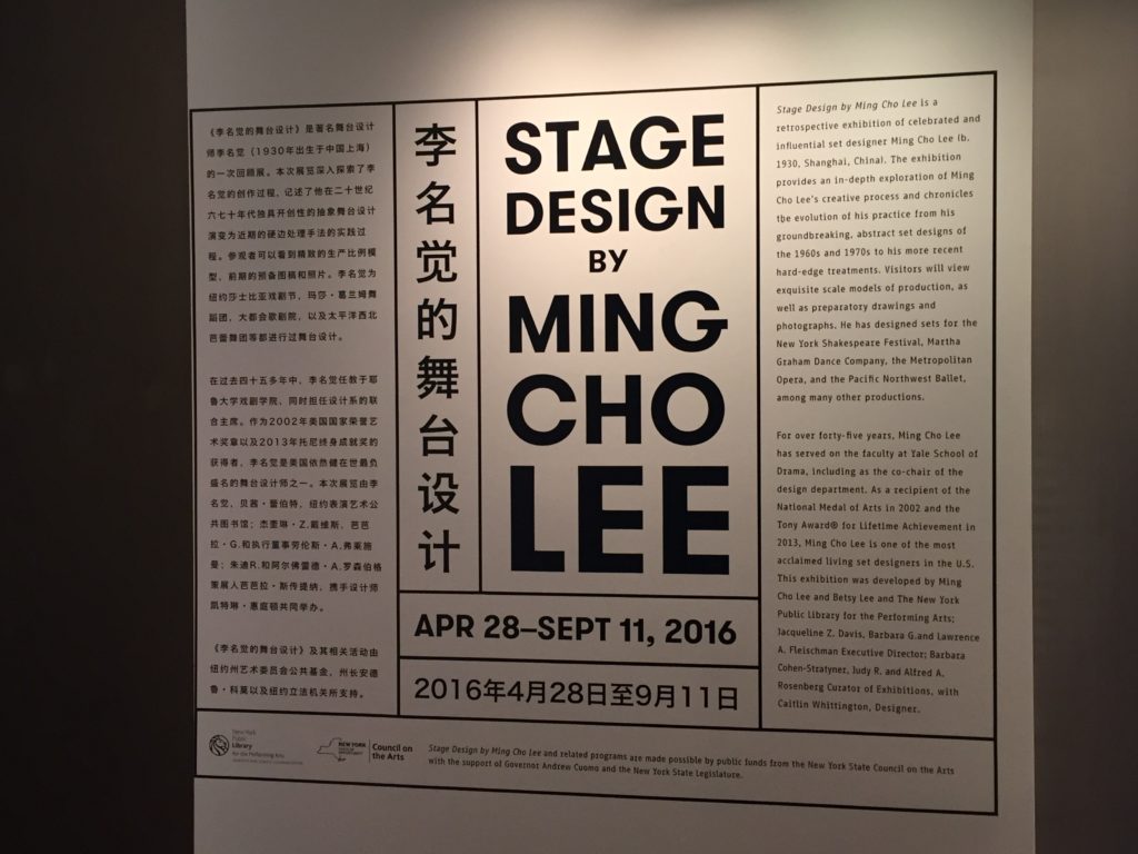
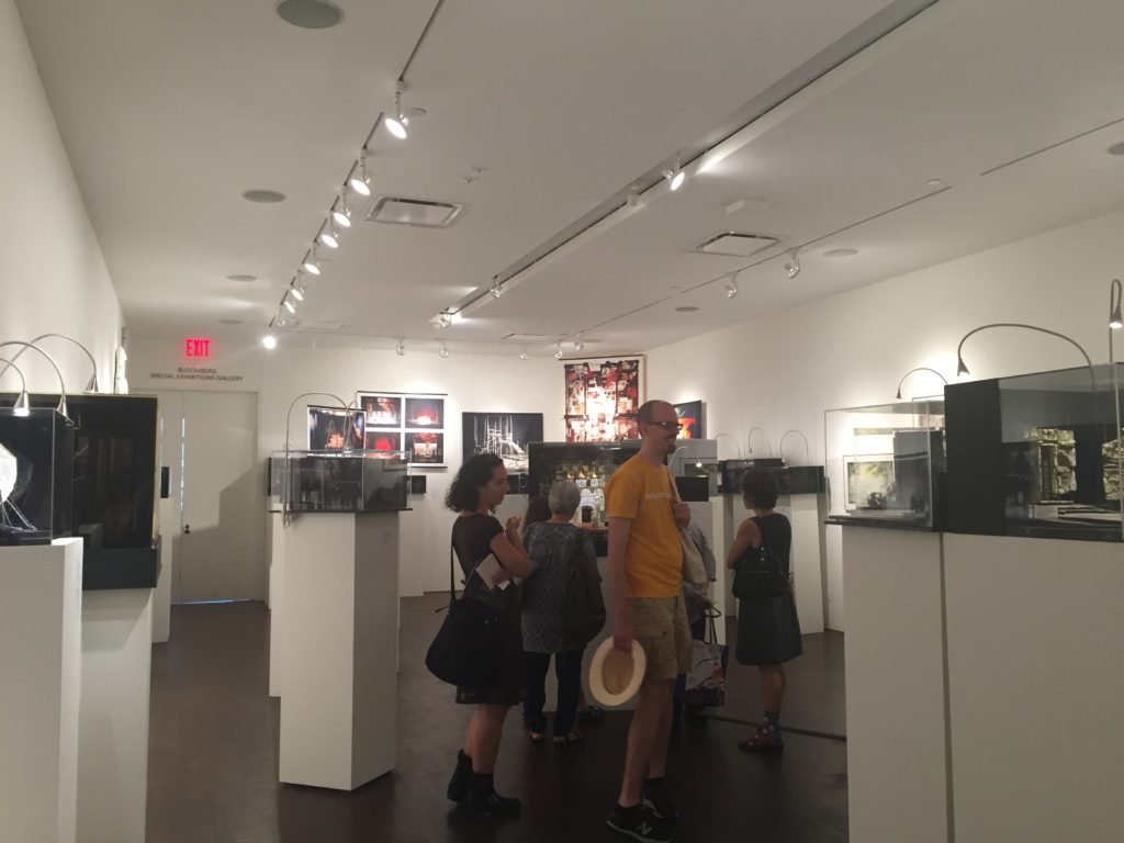
Stage Design by Ming Cho Lee
The other exhibit were very good. It’s all about stage design and was surprisingly well organized, much better than the one before. The space feels so clean, open and artistic. All stage designs are either well displayed inside beautiful glass cabinets or hang beautifully on walls with nice spacing that let you breathe freely. Lights are also well designed making the space so bright and clean.
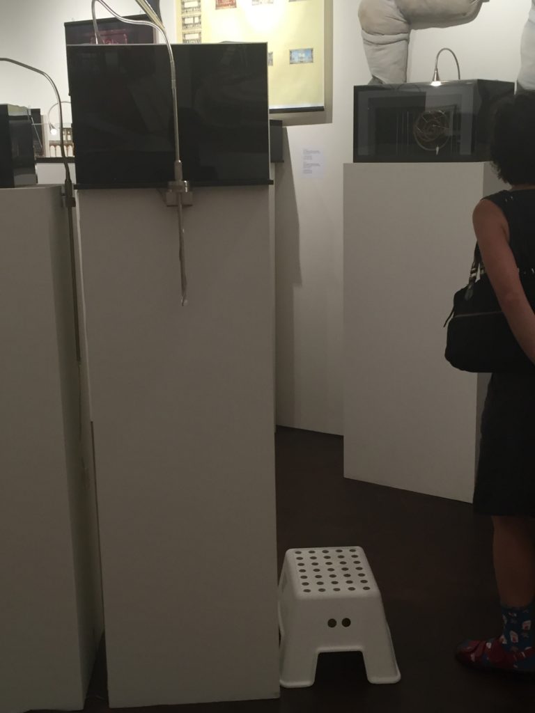
Even children are taken into consideration: there were some small plastic stools for children to step on top, so that they can easily reach the height of cabinets and have a clear view.
Overall feels very good.
Culture and Continuity: The Jewish Journey @ The Jewish Museum
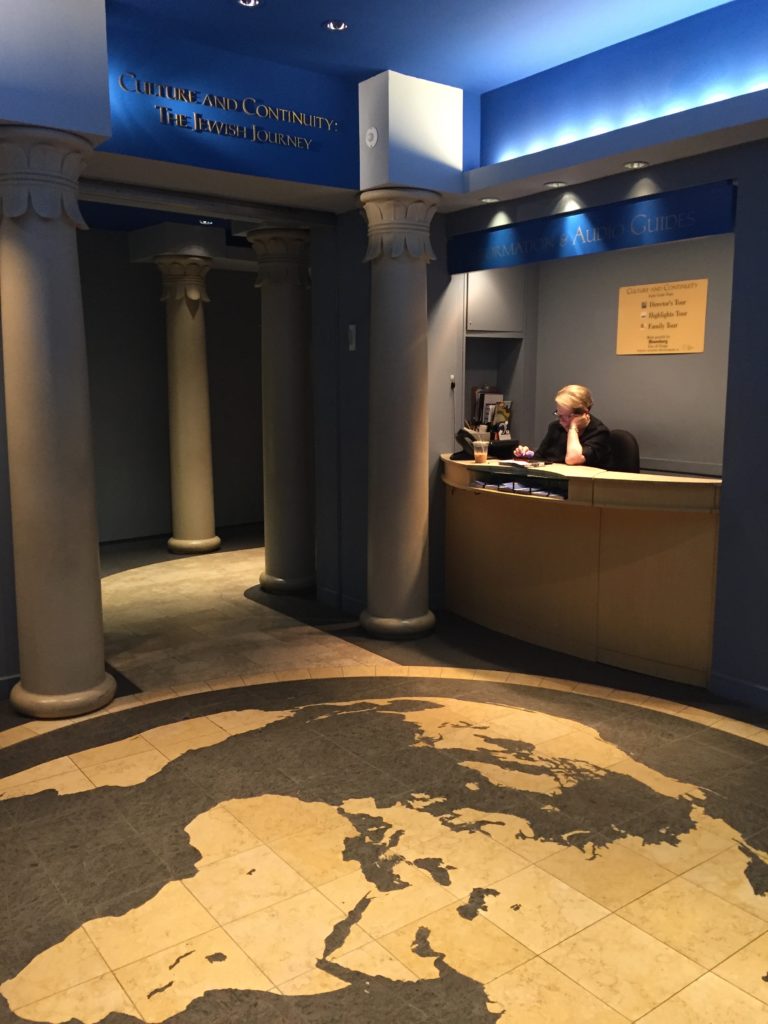
This is a fantastic exhibit, well curated and very well displayed.
It tells a very good story of how the jewish culture emerged, and how they sustained within different nations but still maintaining some core values.
The exhibit is unquestionably beautiful. All the space design, lighting, pacing of story, the choice of color and font size, spacing…they all feel very comfortable and well organized, making the information easy to digest.
As the show before, it is also organized chronically, but also led by four keywords from the Bible: Covenant, Exodus, Law, Land. They are well chosen so as that the whole history can be concluded in these four words. And they repeat themselves at some key point in the exhibit. Just feels so symmetric as beautiful as the famous symmetric jewish patterns.
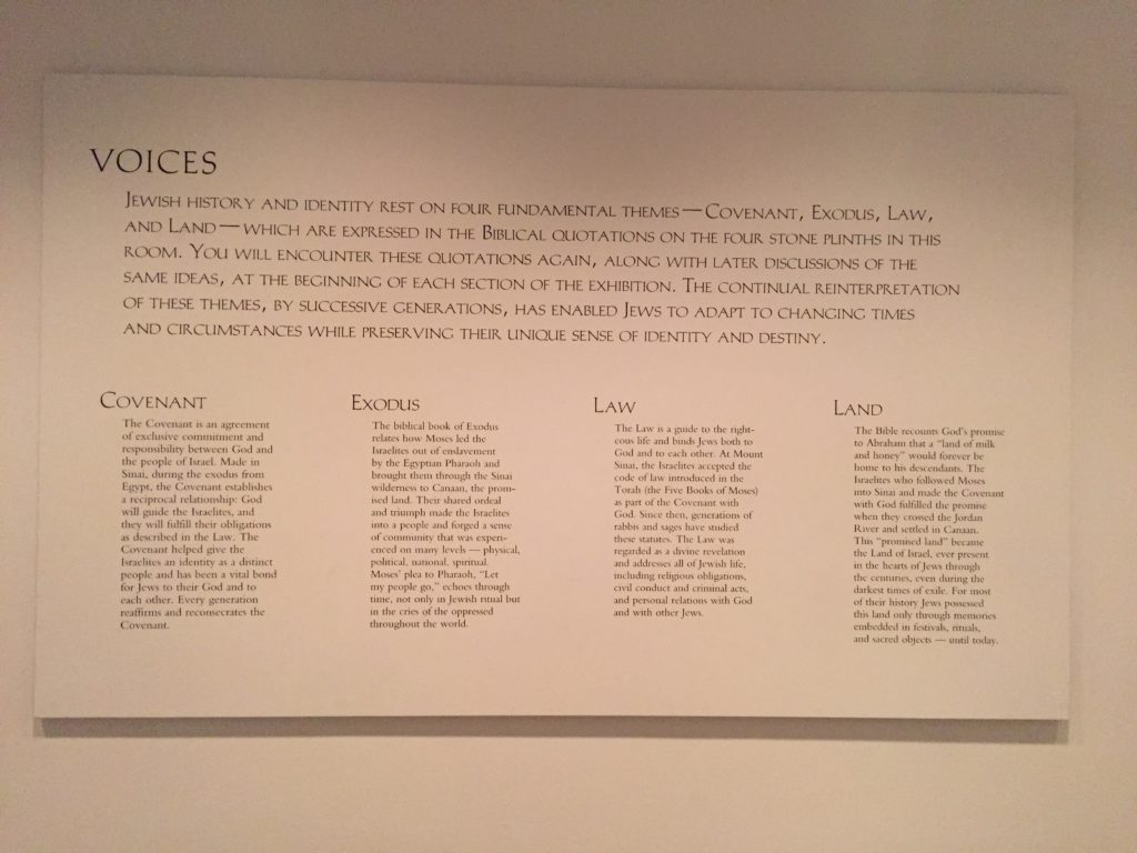
The four key words
And all of them well grouped by smaller topics, fit in well in that age and the storyline (sabbath, menorah, etc).
Well explained (nice font of captions, nice spacing). Nice length of paragraph easy to absorb. Captions are all placed at the height of knees, led by a bluish quote telling the storyline either from the Bible or from a single person, then all of them are well labeled by numbers so you can easily refrence which is which.
Nice use of color and light to create different emotions. Light reflected through the stones at the entrance feeling sacred. Red light projected to the ruins induces sad feelings about destruction.
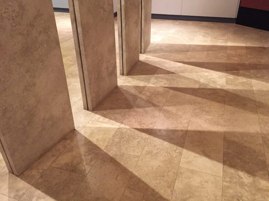
Elegant lighting
Nice visualizations (geographic maps), nice use of space (four/ six faced cabinets). Colorcoding explanation of a ? Nice size of things to create the grand feelings (high ceilings, big mosaic floor so big and powerful)
Some collections are well placed in related contexts, which means a big photo of the original space as the background, or a replica of a room or an architecture.
Nice chairs for computers (also for resting) Just halfway of the show. Nicely done.
Overall so great. Learned a lot as for design.